Often people think that usability is very costly and complex but research by Jacob Nielsen, one of the world’s leading usability experts, has shown that user-testing with just five users is all you need to reveal 80% of a website’s usability problems. Go above that number you do not add significantly more insight. We regularly undertake user testing on our clients’ retail websites and ensure they are providing the best possible customer experience. Here are just a few of the most common issues our testing has highlighted.
1. Page speed
Slow websites frustrate customers and may cause them to abandon a task altogether. Running your website through online page speed testing tools such as Google’s PageSpeed Insights is a great way to identify any technical issues that are affecting the speed of your web pages. However this isn’t always the full story. Until you see how your site actually loads for your customers, insight to their experience is always going to be limited.
Modern day web users expect a seamless, even instantaneous experience navigating a website and any form of perceived delay can cause dissatisfaction. Tests often capture users repeatedly clicking links on slow loading pages.
As well as making sure your website passes online page load speed tests with flying colours, make sure it’s performing for your real life customers through user testing as well as Google Analytics.
2. Poor product descriptions
Users need to be able to quickly locate and find information about products. From our past tests, we’ve seen common themes of what information users want to find including information such as questions about use, benefits, care, sizing or measurements.
Although users often scan website copy, it’s a common misconception that they do not read or value the content. Product information is often too brief and hasn’t had the attention it deserves or is constrained by the page layout – often hidden in a tab or buried down the page. These are common gripes that we find in user tests.
If you are expecting someone to part with their hard-earned cash for something they have not seen in real life then you need to go that extra mile in terms of describing the product.
3. Product imagery
As with product descriptions, the lack of physical contact with a product makes online imagery hugely important in persuading a customer to buy your product. Customers can pick up on details of a product from a quality image; after all, you can’t include every detail of a product in the description.
A common mistake retailers can make is to have small, low resolution images limited to just one or two manufacturer’s stock photos. Employing a quality photographer and spending a bit of time taking high-quality shots of the product in context and adding them to your site at a decent size can do your products the justice they deserve.
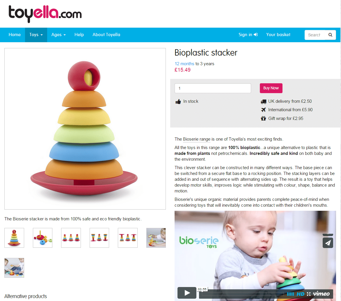
Toyella is a great example of an online retailer doing this well (they don’t do a lot wrong) with great bespoke product imagery and descriptions:
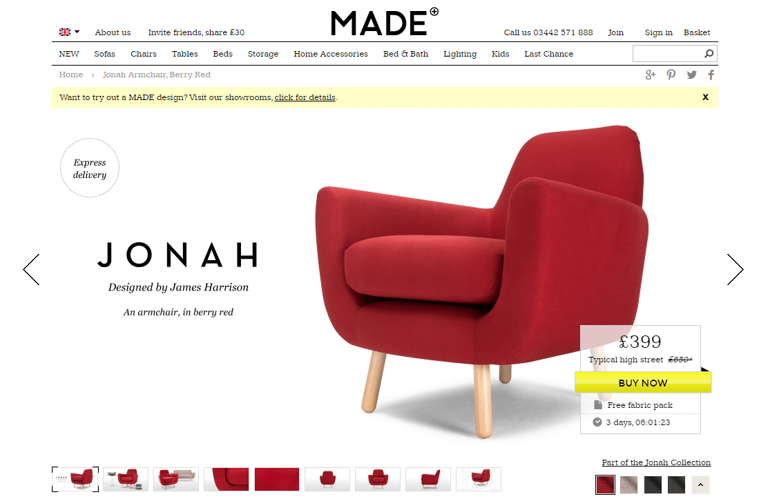
Made.com have always utilised full width product imagery which is an increasing popular trend:
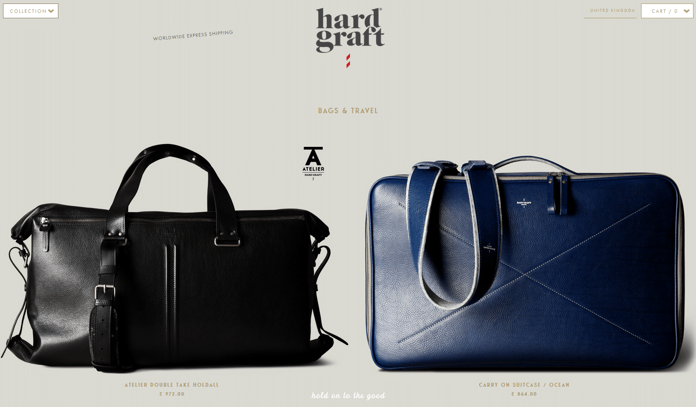
Hard Graft use full width photography on both the category and product pages, as you might imagine, the imagery is pretty important when you want a customer to part with £100s for a bag:
You need to find a fine balance between the image size and page load speed but careful use of large, quality images which are optimised for the web should see improved conversion rates.
4. Lack of delivery returns information
A major barrier when buying products online is the concern a customer might have about buying something they have not seen and that if it isn’t right, they’ll be lumbered with the hassle of returning it.
Key to removing this barrier is to offer free returns and make your returns policy clear and easy to find. If you want to encourage repeat purchases, you’ll need make it as simple and straightforward for customers to return the item. Therefore include return labels and packaging and if you can’t pick it up from your customers then allow them to return it to store or drop it off at Collect+ location for example.
It goes without saying, if you offer free delivery, make sure potential customers know about it. If you don’t, be upfront about delivery costs and don’t hide it in a tiny link in the footer of your site. Customers will only find out at checkout, get annoyed, abandon and probably never come back.
Essentially, make things as clear and simple as possible to remove doubt from the buying journey – don’t give the customer a reason not to buy from you.
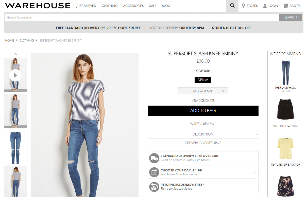
Warehouse has clear messaging of both free delivery and returns on product pages:
5. Checkout security
Checkout security is a serious concern for many online shoppers. Make sure your secure signals and logos are prominent on your website. Simply renaming the checkout heading to “secure checkout” or displaying your SSL certificate prominently can help reduce checkout abandonment rates dramatically.
6. Allow guest checkouts
It is still a common occurrence to find ecommerce sites that require the creation of an account before the customer can complete their order. The theory behind creating an account so it saves customer details is of course sound, however there will always be customers who for many reasons want to check out as quickly as possible and are not expecting to ever come back.
Use guest checkout as the default option, then offer the option to customers to create an account or save the customer details after the purchase is complete and inform them of the benefits of creating an account.
In conclusion
Don’t just rely on your perception when assessing the experience your website provides. Regularly check your site against some of these common causes of frustration by running a series of user tests to identify any issues. As well as highlighting any issues or problems your website has, user testing acts as clear evidence to reinforce why these changes should be implemented. After all, resolving any of these common site issues can have an immediate impact on website conversion rates.